Hambleton House Events and Catering Brand Development
Hambleton House Events and Catering Brand Development
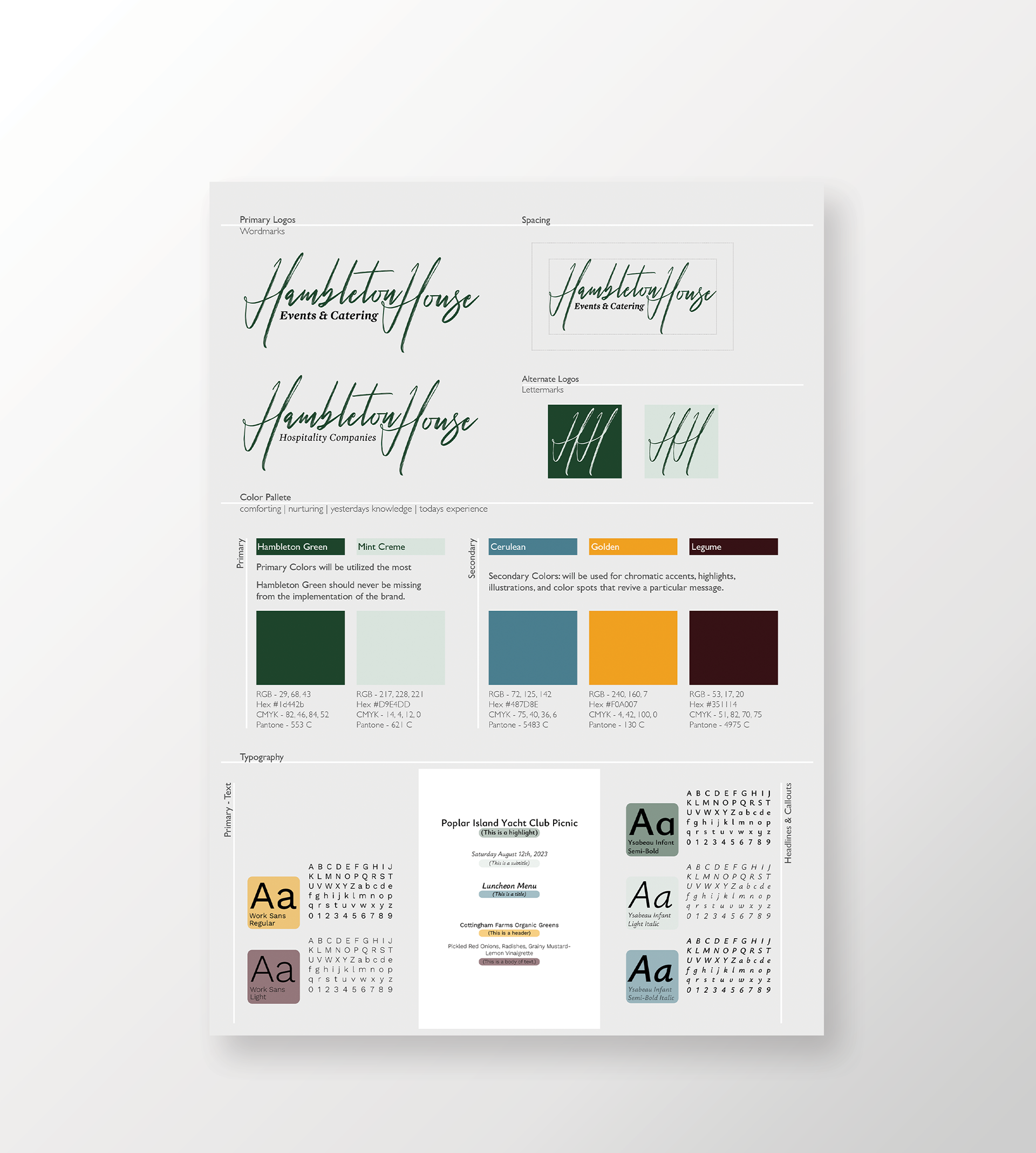
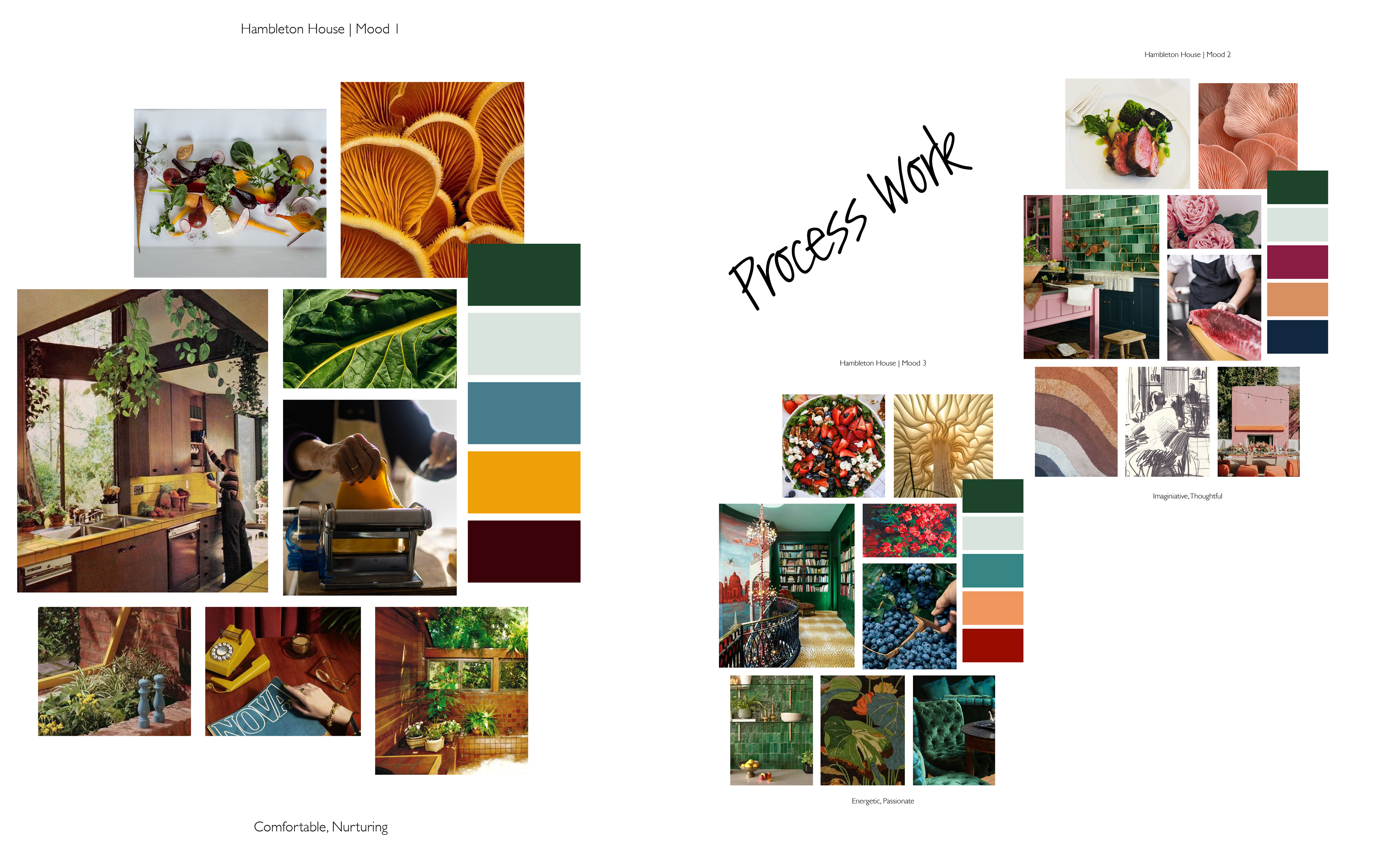
A continuation of Hambleton House's branding, expanding to include appropriate typefaces and colorways. Born from their existing watermark and an exploration of the company's values. I put together three mood board options- it was decided that Mood 3 (comfortable, nurturing) fit the company's main focus best.
The nostalgic colorways speak to the deep colors of homegrown vegetables and the comforting atmosphere that Hambleton House hopes to provide their clients while planning the catering portion of their event.